top of page

Crafting the brand guidelines of a revolutionary packaging brand that seeks to rethink the core principles of packing
With each passing year, global shipping is becoming a more prominent part of our lives. People diligently await the prompt delivery of their packages, often containing boxes that bring smiles across the world. Ecoroots engineered using mushrooms as an alternate source of material for packaging that will save millions of trees and help preserve ecosystems.

Rooted in nature
The rooted logo is an instantly recognizable feature of the brand. It communicates with ease what the brand represents and it interacts with its environment in many unique ways. It was important to allow the logo elements to have enough space and opportunity to make the best of their surroundings.


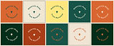
A palette inspired by mushrooms
Ecoroots represents the potential of mushrooms of all kinds to be the next big thing in the world of packaging, and so it spots a diverse colour palette of colours that are commonly associated with mushrooms in nature.


Typography with a soul
Although technology is a key component of innovation, Ecoroots uses typefaces that have a rustic feel that doesn't feel techy as a way of resonating with the essence of nature. This gives any text a sense of soulfulness.


Imagery defined by nature
Ecoroots adopted a prominent visual language inspired by nature- simple, irregular shapes, layers inspired by the overlapping treeline in a forest, and roots of a mushroom that interact with the composition. When combined with the diverse colour palette, they create a soulful representation of a lively forest.


Ecoroots presented an excellent opportunity to work out of my comfort zone with existing brand assets and shape guidelines to bring out the best of the brand ethos

bottom of page