top of page

Bringing to life typography that visually characterizes my personality and life cycle
I am from that generation that grew up with the great transition. Born in 1995, I lived through 3 decades, 2 centuries, and 2 millennia before turning 20. I've used old phones with keypads as well as smartphones that track my steps; stored cassettes for tape recorders as well as created various playlists on a cloud; but most interestingly, I watched old-school teletext as well as modern expressive typography.


Watching and learning
Inspired by BBC Ceefax, I had a dream of creating a typeface with the fundamental structure of 90s pixellated typography that has been adapted to be timeless in a minimalist era where less is more.


Celebrating growth
Being passionate about growth, Millenium Pro is a dynamic typeface where the ligatures have a variety of angles representing that energy and passion. These create vibrant continuity when the alphabet and numbers are used to create words and phrases. At the same time, the minimalist look and feel make them versatile visual assets.
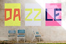
Typography as art
Millennium Pro is a typeface built specifically for headlines. But the letterforms can double up as shapes that can be manipulated in many different ways to create patterns.


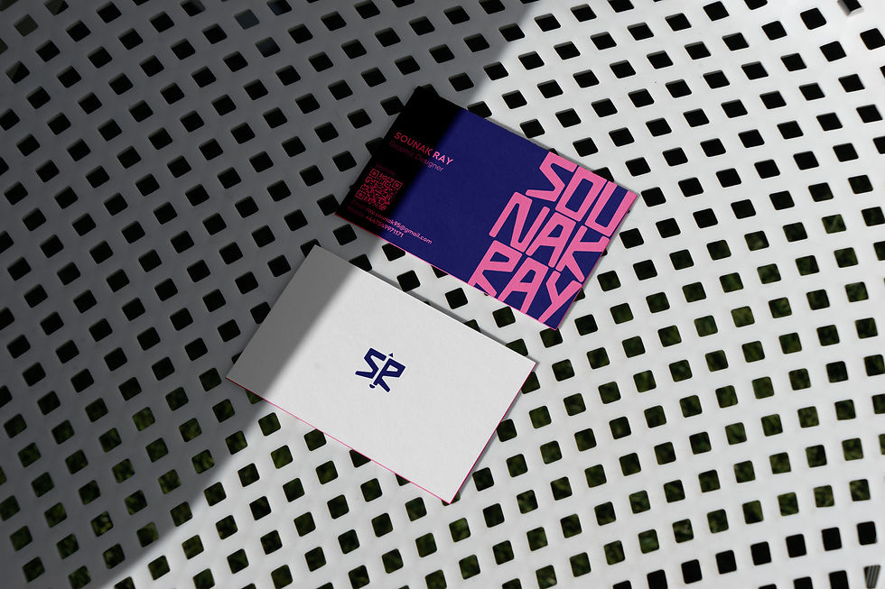
Big and small
Being a versatile typeface, Millennium Pro can be used on canvases of varying sizes. It brings to the table its unique blend of the old world charm and a modern, timeless visual language every time.


This project was close to my heart and the process of bringing this typeface to life showed me more of how typography influences subtle changes in our subconscious and represents history.

bottom of page